
A material board is a designer’s secret weapon. It’s a carefully curated collage of physical samples that brings a project to life, showcasing the actual colors, textures, and finishes you've selected. Think of it as the bridge between a brilliant idea and the finished space—it lets clients and the design team see and, more importantly, feel the materials before a single order is placed.
Why Material Boards Still Matter in a Digital World
With stunningly realistic 3D renderings and immersive virtual walkthroughs at our fingertips, it's fair to ask if physical material boards are becoming obsolete. The short answer is no. They remain an absolutely essential part of the design process for one very human reason: they communicate what a screen simply cannot.
Digital tools are fantastic for showing scale, layout, and how light will play in a room. But they just can't capture the true sensory experience of a space. No render can perfectly replicate the subtle gleam of a glazed tile as you walk past it, the specific hand-feel of a commercial-grade textile, or the cool, solid weight of a quartz countertop. These tactile details are everything when it comes to a client truly understanding and signing off on the vision.
The Anchor in a Hybrid Design Workflow
The modern material board isn't at odds with digital design; it's the perfect partner. It acts as the physical anchor in a hybrid workflow, grounding all those beautiful digital images in reality. This integrated approach is no longer a trend—it's standard practice, combining the speed of technology with the irreplaceable value of physical touch.
The numbers back this up. Today, somewhere between 68–75% of design firms in North America and Europe use physical sample boards right alongside their digital tools. That’s a huge jump from 2018, when only 54% of firms were doing so, with many relying solely on digital presentations.
In a global interior design market valued at over USD 137 billion, where material prices can be incredibly volatile, having tangible samples is crucial for accurate budgeting and getting confident client approvals.
A material board is more than a presentation tool; it's a contract of trust. When a client touches and approves a physical sample, it eliminates ambiguity and sets clear expectations for the final outcome, protecting both the client and the designer.
Beyond Aesthetics to Practical Execution
A great material board is definitely a showstopper, but its job goes far beyond just looking pretty. It's a critical working document for actually getting the project built.
- Client Confidence: It gives clients the power to make informed decisions with genuine confidence. This drastically cuts down the risk of expensive changes or disappointment after everything is installed.
- Budget Alignment: Presenting real materials opens the door for honest conversations about cost. It helps clients see the value and investment tied to each finish, making budget talks much more transparent.
- Procurement Accuracy: A clearly labeled board is the go-to reference for ordering. It minimizes errors and makes sure the exact products you specified are the ones that show up on-site.
- Stakeholder Communication: It creates a single, unified vision for everyone involved—from contractors and architects to specialty vendors—ensuring the whole team is on the same page.
For a deeper look into the tech side of things, it's worth exploring the debate between photorealistic AI room design and manual methods. But at the end of the day, no matter how advanced our technology gets, the human need to connect with the physical world isn’t going anywhere. The material board honors that connection, cementing its place as an enduring and powerful tool in any designer’s arsenal.
Physical vs Digital Material Boards: A Hybrid Approach
Instead of choosing one over the other, the most effective strategy combines the strengths of both physical and digital boards. This hybrid model provides a comprehensive, flexible, and compelling presentation that covers all the bases—from initial concept to final sign-off.
| Attribute | Physical Board | Digital Board | Hybrid Advantage |
|---|---|---|---|
| Tactile Experience | Excellent. Allows clients to feel texture, weight, and sheen. | None. Relies on visual representation only. | Grounds digital visuals with real-world sensory feedback. |
| Color Accuracy | High. Shows true color under actual lighting conditions. | Variable. Dependent on screen calibration and settings. | Digital concepts are verified by true-to-life physical samples. |
| Accessibility | Limited. Requires in-person meetings or shipping. | Excellent. Instantly shareable with anyone, anywhere. | Share digital boards for quick feedback, present physical boards for key decisions. |
| Scalability | Poor. Can be cumbersome to create multiple versions. | Excellent. Easily duplicated and modified for different schemes. | Quickly iterate digitally, then build one final physical board for approval. |
| Contextualization | Limited. Shows materials in isolation. | Good. Can be shown within 3D renderings of the space. | Use renderings to show scale and layout, and the physical board to confirm finishes. |
| Durability & Portability | Moderate. Can be heavy and samples can get damaged. | High. No physical wear and tear; stored in the cloud. | A digital record serves as a permanent, easily accessible backup. |
Ultimately, leveraging both formats creates a powerful, persuasive narrative. The digital board sells the big-picture vision, while the physical board closes the deal by making it real.
Building the Strategic Foundation for Your Board
Before you even think about ordering a single sample, the real work of creating a compelling material board for interior design begins. It all starts with strategy. This early planning is what turns a simple collection of finishes into a powerful tool—one that solves real problems, tells a story, and directly supports the project's business goals.
We have to move past vague aesthetic labels like "modern" or "industrial." Those don't mean much on their own. Instead, a successful board is built on a solid framework of well-defined criteria that will guide every single choice you make down the line.
Translating Vision into a Material Brief
The first, and arguably most important, step is to create a 'material brief.' Think of this as the constitution for your project. It's a practical document that spells out the non-negotiables and desired outcomes before you start falling in love with specific products.
Imagine you're tackling an adaptive reuse project—turning an old textile mill into a boutique hotel. The material brief wouldn't just say "rustic charm." It would get granular. It would specify performance requirements like commercial-grade durability for the high-traffic lobby flooring, specific acoustic ratings for guest room partitions, and the fire codes all finishes must meet.
Your material brief needs to articulate:
- Performance Metrics: What do these materials need to do? We're talking slip resistance, cleanability, light reflectance values (LRV), and commercial wear ratings.
- Sustainability Goals: Does the client mandate a certain percentage of recycled content? Are we aiming for low-VOC emissions or a specific certification like Cradle to Cradle?
- Sensory Qualities: How should the space feel? Warm and inviting, or crisp and energetic? This is where you define the tactile experience, guiding your texture and finish selections.
- Budgetary Constraints: Get real about the numbers from day one. Establishing a working budget for key categories prevents the team from specifying materials that are dead on arrival.
This document becomes your North Star, ensuring your final material board is a direct, thoughtful response to the project's unique challenges.
Balancing Aesthetics with Functionality
With a solid brief in hand, the curation can finally begin. This isn't just about finding pretty things; it's about finding the right things that tick all the boxes you just established. Every material has to earn its spot on the board by serving both the aesthetic vision and the hard functional requirements of the space.
For example, on a historic preservation project, you're constantly balancing character with performance. You might select a reclaimed heart pine for the flooring to match the building’s original era, but you’d pair it with a modern, low-sheen, high-durability finish that can actually handle commercial foot traffic. It’s a decision that respects history while meeting today's operational demands.
A strategically built material board tells a story of thoughtful problem-solving. It shows clients and stakeholders that you’ve considered not just how the space will look, but how it will perform, age, and serve its users for years to come.
This disciplined approach has a great side effect: it makes the sourcing process so much smoother. With a clear brief, you can request samples with precise specifications, cutting down on the endless back-and-forth with reps. It stops the team from getting attached to a beautiful tile that doesn't meet the required fire code or blows the budget.
When it's time to assemble everything, a professional backing is essential for a polished presentation. Many designers find that lightweight yet sturdy foam board options provide a clean, excellent foundation for arranging samples. Ultimately, this foundational phase elevates your material board from a simple mood board to a critical project tool that drives decisions and sets the stage for a successful build-out.
Getting Your Hands on the Right Materials
Once you’ve nailed down the strategy, it's time for the fun part: bringing your vision to life by gathering the actual materials. This phase is where logistics, relationships, and a good design eye all come together. Sourcing isn't just about clicking "order sample" online; it's about building a network of people you can count on and learning how to ask for exactly what you need to get it right the first time.
Your starting point is always your network of suppliers, manufacturers, and local artisans. For those of us working on commercial or historic preservation projects, these relationships are gold. A fabric rep who knows you well won't just dump the latest catalog on your desk. They'll actually understand your project's specific demands—like needing a certain durability rating for lobby seating or hitting a specific fire code—and will point you to the right options from the get-go.
These connections don't happen overnight, but the payoff is huge. Make a point to show up at local industry events, schedule coffee with your reps even when you don't have a project on the books, and always be upfront about your timelines and budget. A good relationship can mean getting that oversized sample you desperately need, a heads-up on new product launches, or critical intel on stock levels and lead times that can make or break a schedule.
How to Ask for Samples (and Actually Get What You Want)
When you're requesting samples, vagueness is your worst enemy. Asking for "a light wood flooring sample" is a surefire way to end up with a pile of useless options, wasting everyone's time. Your request needs to be as specific as the brief you wrote for the project.
Always be sure to specify:
- The Details: Give them the full product name, the SKU or reference number, and the exact colorway or finish you're after.
- Performance Needs: Spell out any non-negotiables. Think "must meet commercial wear layer standards" or "requires a Class A fire rating."
- The Right Size: Don't leave this to chance. Be clear if you just need a small chip for color matching or a much larger piece to show the full pattern repeat or texture.
This level of detail means the samples that land on your desk are already pre-qualified, making the next step of curating the board so much more efficient.
Getting the Scale and Proportion Just Right
One of the most common rookie mistakes I see is using samples that are completely out of scale. A tiny 2×2 inch carpet square tells you absolutely nothing about how a broadloom product will feel across a massive hotel lobby. The goal here is to choose sample sizes that give an honest impression of the material's impact in the final space.
Your material board is a miniature version of the project. If the scale is off on the board, you’re setting your client up with skewed expectations of the finished room. A large-format tile absolutely needs a large sample to be understood.
Choosing the right sample size is key to building a board that's both beautiful and informative. It’s a bit of an art, but having some go-to guidelines helps keep everything in balance.
Here’s a quick reference I use to make sure the samples are scaled properly and tell the right story.
Recommended Sample Sizes for Common Materials
| Material Type | Recommended Minimum Size (cm/in) | Reasoning |
|---|---|---|
| Flooring (Tile, Wood, LVT) | 30 x 30 cm (12 x 12 in) | This size is large enough to show texture, pattern variations, and the natural color shifts you see in materials like wood. |
| Carpet | 45 x 45 cm (18 x 18 in) | Anything smaller fails to capture the true scale of the pattern and the actual feel of the pile under your hand. |
| Wallcovering | A3 size or 30 x 42 cm (12 x 17 in) | You absolutely need this much space to see a full pattern repeat and judge the texture from a realistic distance. |
| Upholstery Fabric | 25 x 25 cm (10 x 10 in) | You need a piece big enough to drape and fold so you can see how it moves and how light plays with its texture. |
| Paint | 20 x 25 cm (8 x 10 in) Painted Swatch | A tiny paint chip is useless. A larger painted board shows the true color and sheen away from the influence of existing wall colors. |
| Laminates & Veneers | 15 x 20 cm (6 x 8 in) | This is a great size to show off wood grain, finish, and color while still fitting neatly on a crowded board. |
By getting the scale right, you're presenting a more accurate, professional, and convincing design concept.
Of course, the final mix of materials will look very different depending on the project. A residential board might have 8–10 key samples, with 30–40% being engineered wood products. Flip to a commercial or hospitality job, and you'll see a heavy emphasis on fire-rated and high-performance laminates, often making up 45–55% of the finishes. In fact, firms that standardize their board templates for these larger projects have seen a 12–18% reduction in ordering mistakes and a 6–9% decrease in material waste. You can dive deeper into material trends in home and commercial furnishings to see how these numbers are evolving.
Taming the Sample Chaos
As those boxes of samples start rolling in, your studio can descend into chaos pretty quickly. A well-organized material library—whether it’s a whole room or just a smart system of labeled bins—is absolutely critical for your sanity and efficiency. The minute a sample arrives, label it with the core info: supplier, product name, and SKU. No exceptions.
This library becomes a living, breathing archive for your firm. When a new project kicks off, you’ll have a curated collection of go-to materials right at your fingertips, which makes that initial hunt so much faster. It’s what stops you from having that frantic, last-minute panic trying to find "that perfect tile we used two years ago," ensuring every choice you make is deliberate and perfectly aligned with your project's goals.
Assembling a Professional and Persuasive Board
You’ve sourced and curated a perfect collection of samples. Now comes the fun part: assembly. But don’t be fooled—a pile of beautiful materials isn’t enough to win over a client or, just as importantly, guide a construction team. The real magic of a material board for interior design is in its composition. It's how you arrange every single element to tell a clear, compelling story that transforms your design concept into a tangible, persuasive argument.
The goal is to create a visual hierarchy, guiding the viewer's eye through the design just as you would guide them through the finished space. Think like a composer. Start with your "hero" materials—the dominant finishes like flooring or a key wall treatment. Lay those down first; they’re the foundation of your design. From there, you can begin to layer in the secondary and accent materials, carefully arranging them to show exactly how they’ll interact.
Mastering Layout and Composition
There’s no single right way to lay out a board, but the most effective ones all share a common DNA: they’re logical. The key is to organize materials in a way that reflects their real-world application and scale. This intuitive flow helps clients and stakeholders get the design instantly, often without you having to say a word.
A classic and highly effective technique is to arrange samples spatially. Think of the board as a cross-section of the room. Place flooring materials along the bottom, wall finishes (paint, wallcovering, tile) in the middle, and any ceiling or feature lighting finishes toward the top. Upholstery fabrics and accent metals can then be grouped together nearby, representing the furniture and fixtures that will populate the space. It’s a simple trick that creates an intuitive map of your design.
Consider a few different approaches to your layout:
- The Grid: This is a clean, buttoned-up approach where samples are cut to uniform sizes and arranged in a structured grid. It works beautifully for corporate or minimalist projects where precision and order are part of the design language.
- The Layered Vignette: For a more organic, artful composition, you can create a small "scene" where samples overlap. Imagine draping a luxe fabric swatch over a piece of wood flooring, right next to the tile it will abut. This helps clients visualize the textural interplay in a much more tangible way.
- Proportional Representation: The size of your sample should hint at its dominance in the space. The primary carpet sample should take up more real estate on the board than a tiny swatch for a single accent pillow. This visual cue helps manage expectations and communicates scale.
The most persuasive material boards are the ones that feel balanced and intentional. Every sample needs a reason to be there, and its placement should reinforce its relationship to every other material on the board.
Choosing the Right Foundation and Adhesives
The physical backing of your board says a lot about your professionalism. A neutral, sturdy base is non-negotiable. Heavy-duty foam core or Gatorboard in white, grey, or black are the industry go-to's for a reason. They're light enough to carry to a meeting but rigid enough that they won’t warp under the weight of heavy samples like stone or tile.
Just as important is how you stick everything down. Nothing tanks a presentation faster than a tile sample clattering onto the conference table. For heavy items, use a high-strength, fast-grabbing construction adhesive or a quality double-sided mounting tape. For lighter fabrics and papers, a clean spray adhesive or rubber cement applied neatly to the back prevents buckling and keeps everything looking crisp.
The sourcing process is the critical first step before you even think about adhesives, as this diagram shows.
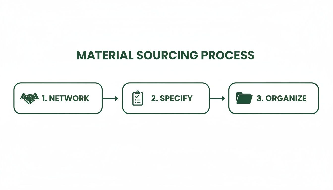
A great board is the culmination of methodical networking, precise specification, and diligent organization—it all starts long before you reach for the glue.
The Critical Role of Labeling and Documentation
A beautiful board without documentation is just a pretty picture; it’s not a working tool. Every single sample must be meticulously labeled. This is the step that elevates your presentation from a visual aid to an actionable specification document that the entire project team will rely on for pricing, procurement, and installation.
Your labeling system has to be clean, consistent, and easy for anyone to decipher. My team has always had success with a simple key system:
- Assign a unique code to each sample on the board. Think F-01 for flooring, WC-01 for wallcovering, P-01 for paint.
- Place a small, discreet label with that code next to its corresponding sample on the physical board.
- Create a separate specification sheet (or "key") that lists each code alongside all the vital product information.
This spec sheet is the board's essential partner. It’s what makes the design buildable. At a minimum, it should include:
- The unique reference code (e.g., F-01)
- A clear description ("White Oak Engineered Hardwood")
- Manufacturer/Supplier name
- The specific product name, number, or SKU
- Color name and/or finish code
- Dimensions or size information
This two-part system keeps the board itself looking clean and professional while providing all the granular detail needed to execute your vision. It eliminates guesswork and ensures that the materials you and your client fell in love with are the exact ones that get ordered and installed, protecting the integrity of your design right through to the finish line.
Advanced Material Strategies for Commercial Projects
When you step into the commercial design world, the material board evolves. It’s no longer just a creative exercise; it’s a technical document that has to work a lot harder. For projects like corporate offices, hotels, or bringing an old building back to life, the board must satisfy a whole different set of masters: building codes, sustainability goals, and long-term performance.
A commercial board is less about a particular taste and more about making a case. Every single sample has to earn its spot by proving it can handle heavy traffic, meet tough safety standards, and contribute to the health of the people inside. This is where a designer’s deep product knowledge is put to the test, turning a simple presentation tool into a document that manages risk and protects the client’s investment.
Weaving Sustainability and Wellness into the Narrative
Let's be clear: sustainability isn't an add-on anymore. It’s a core requirement for most commercial clients, driven by everything from corporate ESG (Environmental, Social, and Governance) goals to what their own tenants are demanding. Your material board is ground zero for showing them you get it.
This goes way beyond just pointing to bamboo flooring. You need to back up your selections with hard numbers. So instead of just showing a nice carpet sample, the spec sheet should call out its exact percentage of recycled content, its Cradle to Cradle certification, or its low-VOC (Volatile Organic Compound) emissions. Pulling data from an Environmental Product Declaration (EPD) turns a pretty choice into a powerful, defensible one.
A truly smart material board doesn't just show finishes. It shows choices that create healthier indoor air and support a more responsible supply chain. That's a language that speaks directly to clients who are laser-focused on their ESG metrics.
If you’re presenting to a client chasing a WELL or LEED certification, the board and its spec sheets are your evidence. Make it easy for them. Clearly tag materials that help earn specific credits, such as:
- Acoustic Performance: Highlighting materials that kill noise bleed in an open office.
- Light Reflectance Value (LRV): Calling out paints and surfaces that bounce daylight around, cutting down on electricity bills.
- Material Transparency: Featuring products that come with health disclosures and a clear list of ingredients.
The Special Cases: Adaptive Reuse and Historic Preservation
Working with existing and historic buildings is its own beast. Here, the material board has to create a conversation between the old and the new. It's a delicate dance—you have to respect the building's history while getting it ready for a modern, functional future.
Take an adaptive reuse project, like turning an old warehouse into a buzzy tech office. Your board might pair the original, polished concrete floor with slick, high-performance acoustic felt panels. The story you're telling is one of contrast and complement. The new stuff doesn't hide the building's character; it celebrates it.
For a true historic preservation job, the work is even more detailed. Finding period-appropriate finishes that also meet today's codes is a real skill. Your board might need to showcase things like:
- A custom-milled wood trim that’s an exact match for the original, but sourced from a sustainably managed forest.
- A historically accurate paint color, but one that’s formulated with modern, durable, low-VOC chemistry.
- A new tile that perfectly replicates an original encaustic pattern but also has a commercial-grade slip-resistance rating.
Communicating Technical Compliance with Clarity
For any commercial project, the board has one job that trumps all others: proving compliance. Looks don't matter if a material fails a fire code inspection. Your presentation has to make it crystal clear that all the technical boxes have been checked.
This means putting the critical performance specs right on your board’s key or the attached spec sheet. Don’t make the client or the contractor go digging for it. Think of your documentation as the single source of truth.
Key Technical Specs to Call Out:
- Fire Ratings: State the ASTM E84 classification (Class A, B, or C) for every wall and ceiling finish. In public spaces, this is absolutely non-negotiable.
- Slip Resistance: Note the DCOF (Dynamic Coefficient of Friction) rating for all flooring. You need to show it’s appropriate for where it’s going—a lobby has different needs than a commercial kitchen.
- Durability Ratings: Include the wear layer thickness for LVT or the AC (abrasion class) rating for laminates to prove they can handle the expected foot traffic.
- Accessibility Standards: Confirm that your specified materials and transitions meet ADA (Americans with Disabilities Act) guidelines.
When you bake these strategies into your process, your material board becomes so much more than a design pitch. It becomes a comprehensive, bulletproof plan that tackles the real-world complexities of commercial work. It gives clients the confidence that their investment isn't just beautiful—it's safe, sustainable, and built to last.
Answering Your Top Questions About Material Boards
Even after years in the field, pulling together the final material board can bring up some tricky last-minute questions. It’s the point where the creative vision meets the hard reality of budgets, sourcing, and client psychology. Let's tackle some of the most common hurdles I see designers face.
How Many Material Options Should I Put on a Board?
My rule of thumb? One board, one story. Your goal is to present a single, fully resolved design direction, not a collection of possibilities that leaves the client feeling overwhelmed. When you present too many choices on one board, it can dilute your vision and actually make it harder for the client to say "yes."
If you truly have two distinct concepts you want to explore—say, a warm, classic palette versus a cool, modern one—then create two separate, complete boards. Each one should feel like a finished thought. For a typical residential project, you might have 8-12 core materials working together. A commercial board, on the other hand, might be more focused, zeroing in on a smaller set of high-performance finishes that need to work across a large space.
Your job is to be the expert. Presenting a single, confident vision is far more effective than offering a buffet of options. It guides your client toward a clear decision and shows you’ve already done the hard work of editing.
What's the Best Way to Label Samples on a Physical Board?
Labels are all about clarity and professionalism. You want a system that looks clean on the board but connects to a wealth of detail behind the scenes. I find the best method is to use small, neatly printed tags next to each sample.
On the tag itself, keep it simple: a reference code (F-1 for Flooring 1, P-2 for Paint 2), the material name, the manufacturer, and the specific color or product code. That reference code is your secret weapon. It directly links each physical sample to your detailed specification sheet, which should always accompany the board. That spec sheet is where you’ll list everything needed for procurement—vendor contacts, pricing, lead times, the works.
Should I Charge a Separate Fee for Creating a Material Board?
In most cases, no. Creating the primary material board is a fundamental part of the design development phase. It’s how we communicate our vision and get final sign-off on the specs. As such, the time and effort are almost always baked into your overall design fee, whether that's hourly or a flat rate for the project.
The exception? Revisions and scope creep. If a client asks for multiple, extensive revisions or wants to see entirely new concepts that go far beyond what you originally agreed to, it's absolutely fair to charge for that extra work. This is when you’d bill for your additional time sourcing materials and assembling new boards, based on the hourly rate outlined in your contract.
At Sherer Architects, LLC, we know a well-crafted material board is more than just a presentation tool—it's the foundation of a successful project, ensuring the vision and reality align from day one. Our deep experience in commercial, adaptive reuse, and historic preservation projects means every material choice is strategic, sustainable, and beautiful. If you're ready to bring structure to your vision and create enduring results, explore our services and see how we work.