
The principles of architectural design are less a "set of strict rules" and more "time-tested principles" for creating buildings that just feel right. These core concepts—like balance, rhythm, proportion, hierarchy, and unity—are the secret ingredients that shape how we experience everything from towering commercial high-rises to thoughtful historic renovations.
Decoding the Blueprint of Great Architecture
Have you ever entered a room and felt an instant sense of peace? Or stood before a building and been completely struck by its presence? That's not magic; it’s design at work.
Architects use these foundational principles to compose a structure, much like a musician arranges notes to create a melody. They aren't rigid laws but a flexible toolkit, allowing designers to solve complex problems and craft spaces that resonate with us on a deeper level.
This guide is designed to move past the dry, academic definitions. We're going to break down the essential concepts that turn a mere structure into a meaningful place. Once you grasp these ideas, you’ll start seeing the world differently—noticing the deliberate thought behind every facade, lobby, and public square you pass.
The Language of Form and Function
At its core, architecture is a constant conversation between what a building looks like (form) and what it does (function). The principles of design are the vocabulary of that conversation. They allow a building to communicate its purpose, direct our movement, and stir emotions, all without a single word.
Here are the key ideas we’ll be exploring:
Balance and Proportion: This is all about creating visual equilibrium and ensuring different parts of a building feel right together and in relation to us.
Rhythm and Repetition: Think of this as the visual beat of a building. It's the pattern that guides your eye and creates a sense of ordered movement.
Hierarchy and Contrast: This is how architects tell you what’s important. They use it to draw your focus to a grand entrance or a central atrium.
Unity and Harmony: This is the ultimate goal—making sure every individual element works together to create a cohesive, complete experience.
Think of these principles as the underlying grammar of a building. Just as grammar structures sentences to convey clear meaning, these principles structure a building's elements to create a clear and compelling architectural narrative.
Why These Principles Matter
Getting a handle on these concepts isn't just for architects. It’s vital for anyone shaping our built environment, from developers to business owners planning a new space. A building grounded in solid design principles is more than just easy on the eyes; it's more effective, enjoyable to use, and ultimately, more valuable.
It can boost productivity in an office, enrich the customer journey in a store, or gracefully give a historic landmark a new purpose. To dive deeper into how professionals think about this, check out an architect's insights into design.
Building Harmony with Proportion and Scale
While balance gives a building its sense of stability, proportion and scale are what make it feel right. It’s an almost subconscious thing we experience. Think of proportion as the building's internal harmony—how all its parts relate to each other. Do the windows feel like they belong to the facade? Does the roofline complement the main structure?
Scale, on the other hand, is about how the building and its components relate to us, the human beings who use it. A massive doorway might look proportional to a cathedral's facade, but it can feel intimidating and out of scale for a single person walking through it.
When these two work in tandem, a space just feels intuitive and welcoming. It's not some lofty, abstract idea; it's the bedrock of creating functional, comfortable places people want to be in.
This isn’t a new concept, either. For centuries, architects have leaned on mathematics to bring a sense of order and beauty to their creations. The ancient Greeks were masters of this. Around 500 BC, Pythagoras was exploring how simple integer ratios created musical harmony. The thinking was, if it works for music, why not for architecture? They believed the same mathematical logic could create spatial harmony, resulting in a building that was both structurally sound and aesthetically pleasing. You can explore more on the deep ties between mathematics and architectural form in this historical overview.
Finding the Right Ratios
To achieve this visual cohesion, architects don't just guess. They often turn to established ratios—systems that have been tested and refined over generations to create predictably beautiful results.
The most famous of these is the Golden Ratio, which is roughly 1:1.618. You can find it everywhere, from the iconic Parthenon in Athens to the elegant spiral of a seashell. It’s so prevalent in the natural world that it’s often seen as a kind of universal blueprint for what we find beautiful.
But in today’s world, especially for commercial and adaptive reuse projects, other practical systems are just as vital. We often use modular grids built on simpler ratios, like 1:2, which allow for incredible efficiency in construction. These grids ensure that prefabricated components fit together perfectly on-site, which saves a ton of time and money while keeping the final look clean and orderly.
The infographic below shows how some of these different proportional systems stack up.
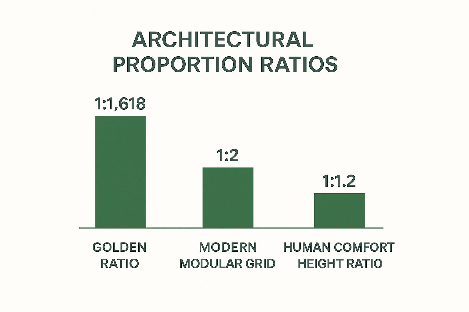
It’s a great visual reminder that while the Golden Ratio offers a timeless, classical aesthetic, modern modular grids provide the practical flexibility needed for so many of today's building projects.
Human Scale in Commercial and Historic Projects
Of all these ideas, the concept of human scale is probably the most important one to get right. A building that’s too monumental can make people feel small and insignificant. One that’s too cramped feels claustrophobic. Hitting that sweet spot is all about designing spaces that respect the actual size of the human body.
This is absolutely critical in a few specific types of projects:
Commercial Buildings: Think about a retail store. The height of the shelves, the width of the aisles, the placement of the checkout counter—all of it needs to be scaled for comfort and easy access. In an office, ceiling heights and workspace dimensions can make or break employee well-being and focus. An architect might design a grand, high-ceilinged lobby to impress visitors (monumental scale), but the reception desk within it has to return to human scale to feel welcoming.
Adaptive Reuse: Taking an old warehouse and turning it into apartments is a classic challenge of scale. You have these massive, open floors that need to be broken down into living spaces that feel cozy, not cavernous. The trick is to do it without erasing the building's industrial character, often using partial-height walls or distinct furniture zones to bring the scale down to a human level.
Historic Preservation: When working with historic buildings, respecting the original scale and proportion is non-negotiable. If you're adding a modern extension, the new structure can't shout over the old one. The goal is for the addition to complement, not dominate, the original design's elegant proportions.
By mastering proportion and scale, architects can craft environments that don't just look good, but feel good. It’s the subtle art of making a building speak a language of comfort, order, and human-centric design, ensuring it serves its occupants on both a practical and an emotional level.
Finding Equilibrium with Balance and Symmetry
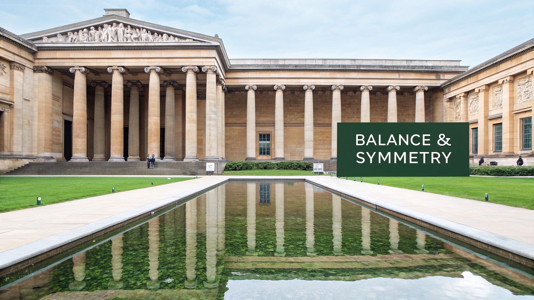
Of all the design principles in architecture, balance is perhaps the most visceral. It’s that invisible force that gives a building a sense of stability, a visual calm that we feel almost instinctively. Think of it as the building's center of gravity. When the visual weight of every window, column, and roofline is distributed correctly, the entire structure feels grounded, intentional, and just plain right.
But balance is so much more than just making things look even. It's a powerful tool architects use to tell a story and evoke a specific feeling. A grand, formal courthouse and a fluid, modern art museum might both be perfectly balanced, but they achieve that equilibrium in completely different ways to shape our experience of the space.
To really get a handle on balance, we need to look at its three primary forms: symmetrical, asymmetrical, and radial. Each one offers a unique language for organizing a design, with its own set of rules and applications across commercial, adaptive reuse, and historic preservation projects.
Symmetrical Balance: The Mirror Image
Symmetrical balance is the one we all recognize instantly. It's clean, classic, and straightforward. If you could draw a line down the middle of a building and each side is a perfect mirror image of the other, you’re looking at symmetry. This approach creates an immediate sense of order, formality, and permanence that’s hard to ignore.
There’s a reason this type of balance shows up so often in our most important civic and institutional buildings.
Government Buildings: Think of the U.S. Capitol. Its perfect symmetry projects an image of unshakable power, stability, and enduring authority.
Financial Institutions: Old-school banks often use symmetrical facades to communicate trustworthiness and reliability. You trust them with your money because they look solid.
Historic Churches and Temples: For centuries, religious architecture has used symmetry to evoke a sense of divine order and cosmic harmony.
Symmetry provides a visual language that is clear and easy to understand. The only downside is that its rigid formality can sometimes feel a bit static or predictable, which might not be the right fit for projects aiming for a more dynamic, modern feel.
Asymmetrical Balance: The Art of Composition
Now, this is where things get interesting. Asymmetrical balance is more complex, more nuanced, and offers a whole lot more creative freedom. Instead of simply mirroring elements, it achieves equilibrium by carefully arranging objects of different visual weights. It’s like a well-composed photograph where a single large tree on one side is balanced by a cluster of smaller rocks on the other. It just feels right.
This approach creates a sense of movement, energy, and modernity. It takes a skilled eye to pull it off, but when it works, the result is incredibly engaging. A building like Frank Gehry's Guggenheim Museum Bilbao is a masterclass in asymmetry; its swirling titanium forms feel like they're in motion, yet the entire composition feels perfectly stable.
In commercial architecture, we often use asymmetry to create visual interest and subtly guide the eye toward a key feature, like the main entrance or a dramatic cantilever.
Asymmetry doesn't mean imbalance. It's about achieving equilibrium through a careful, intuitive arrangement of unequal elements, resulting in a composition that feels both dynamic and complete.
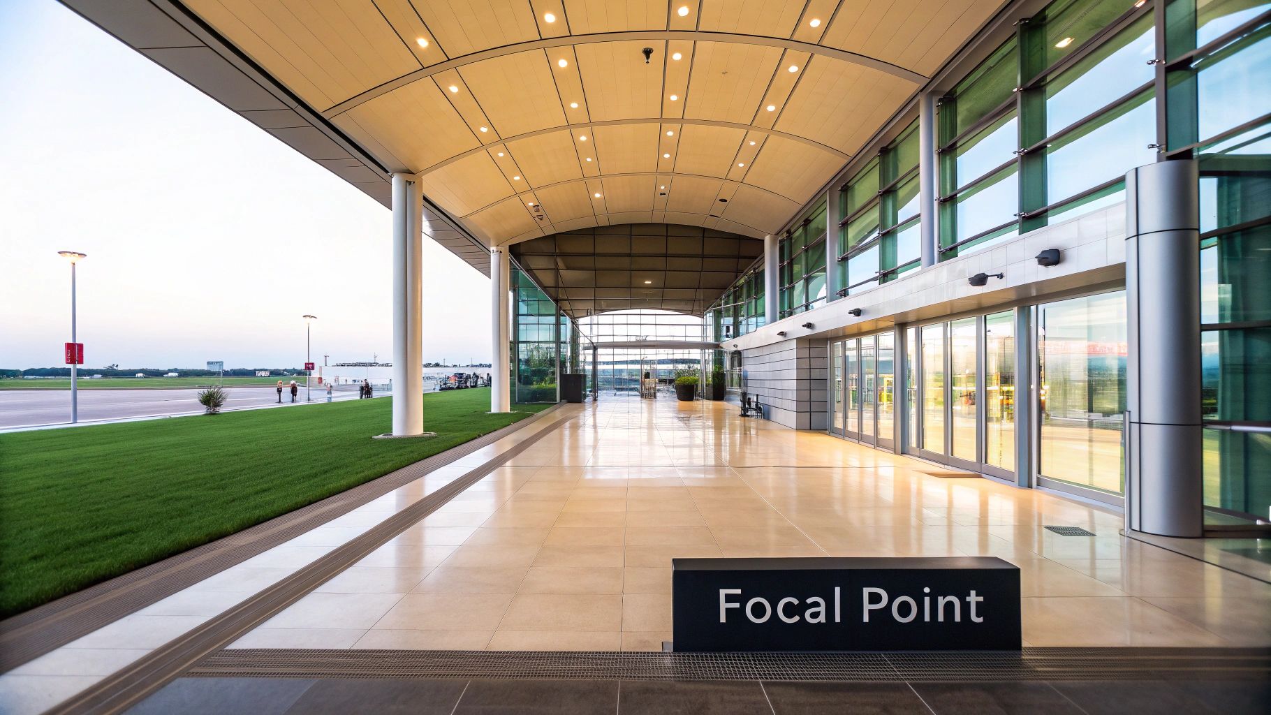
Radial Balance: The Central Point
The third type, radial balance, is all about organizing elements around a single central point. Everything radiates outward from a unifying core, like the spokes of a wheel or the ripples from a stone dropped in a pond. This immediately creates a powerful focal point and a strong sense of unity.
You can see this principle at play in any structure with a grand central dome, rotunda, or circular atrium. The Pantheon in Rome is one of the most timeless examples, with its iconic oculus drawing all attention to the center of its magnificent dome. In modern commercial design, a corporate headquarters might feature a dramatic radial lobby to orient visitors and direct them toward different wings of the building.
Here's a quick look at how these three types of balance stack up against each other. Each has a distinct personality and is best suited for different architectural goals.
Comparing Types of Architectural Balance
Type of Balance | Key Characteristic | Psychological Effect | Common Application Examples |
|---|---|---|---|
Symmetrical | Elements are mirrored across a central axis. | Stability, formality, order, permanence, calm. | Government buildings, banks, historic monuments, classical temples. |
Asymmetrical | Unequal elements are arranged to achieve visual equilibrium. | Dynamism, movement, modernity, curiosity, visual interest. | Modern art museums, creative office spaces, contemporary residences. |
Radial | Elements are organized around a single central point. | Focus, unity, direction, grandeur, community. | Domes, rotundas, circular atriums, central courtyards in civic plazas. |
Understanding which type of balance to use is a crucial early decision in the design process. It sets the tone for the entire project, influencing not just how a building looks, but how people feel when they interact with it.
Creating Visual Flow with Rhythm and Repetition
Think about your favorite song. It has a beat, a recurring melody that pulls you in and makes you want to tap your foot. Architecture does the same thing, but visually. We call this rhythm, and it’s all about creating a sense of movement that guides your eye across a building.
This visual pulse is achieved by repeating elements—think windows, columns, arches, or even material patterns. When done right, rhythm transforms a static structure into a dynamic experience. Our brains are hardwired to recognize patterns, so a well-executed rhythm makes a building feel orderly, intentional, and satisfyingly complete.
A simple row of identical columns creates a steady, marching beat. But if you vary the size of those columns, you can build to a powerful crescendo. Without rhythm, a building can feel like a jumble of disconnected parts. With it, every piece feels linked, leading you on a carefully planned visual tour.
Regular Rhythm: The Power of Consistency
The most common and straightforward type is regular rhythm. This is your classic, steady drumbeat, where elements are repeated at predictable, consistent intervals. It’s a powerful tool for creating a sense of calm, order, and stability.
Just look at the Roman Colosseum. Its iconic facade is a masterclass in regular rhythm, with that powerful, repeating series of arches stacked tier upon tier. The unwavering pattern gives it that feeling of immense scale and permanence that still impresses us today. In a more modern context, you see the same principle in a glass curtain wall with its uniform grid of mullions, projecting a sleek and professional image.
Progressive Rhythm: Building Momentum
Where regular rhythm provides stability, progressive rhythm creates a sense of direction and momentum. This happens when an element repeats but changes in a predictable way—maybe it gets bigger, smaller, or spaced further apart. It’s the architectural equivalent of a musical scale climbing higher and higher.
Imagine a series of clerestory windows that grow taller as they approach a building's main entrance. Your eye is naturally drawn right where the architect wants you to look. It’s a fantastic technique for establishing a focal point and adding a bit of visual excitement without things getting chaotic. It tells a small story of movement or growth, making the design feel more alive.
Rhythm in architecture isn’t just about mindlessly repeating things. It's about arranging elements to create a meaningful visual experience. It’s the difference between a random clatter of notes and a beautiful, cohesive symphony.
Flowing Rhythm: Capturing Natural Movement
Moving away from structured patterns, flowing rhythm is far more organic and free-form. It uses curved lines and undulating forms to mimic the fluid motion you see in nature, like waves rolling onto a shore or wind-sculpted sand dunes.
The late Zaha Hadid was a master of this. Her buildings, such as the Heydar Aliyev Center in Baku, are famous for their sweeping, continuous curves that seem to defy gravity. The entire structure feels like it's flowing from one form into the next, creating something energetic and almost futuristic. This approach can work wonders in adaptive reuse projects. Adding a single flowing element, like a dramatically curved staircase or a wavy feature wall, can create a stunning counterpoint to the rigid, historic lines of an old industrial space, breathing new life and movement into it.
Guiding the Eye with Hierarchy and Contrast
When you walk into a well-designed space, your eyes don't just wander. They're guided. They land on a focal point, then move to the next element of importance in a natural, intuitive sequence. This is no accident—it's hierarchy at work.
Think of it as the visual grammar of a building. Just like a newspaper headline screams for your attention, an architect uses size, scale, color, and material to tell you where to look first. A grand, soaring entrance on an office tower doesn't just look impressive; it clearly says, "This is the way in." Without this visual ranking, a building can feel confusing and chaotic.
Contrast: The Engine of Hierarchy
You can't have hierarchy without its powerhouse partner: contrast. At its core, contrast is about placing dissimilar elements next to each other to make one stand out. It’s the visual tension that pulls your eye and creates real interest. A building without contrast becomes a flat, monotonous surface where everything carries the same visual weight, leaving you lost.
Architects have a whole toolkit for creating this effect, and these techniques are incredibly versatile, whether for a brand-new commercial tower or a delicate historic preservation project.
Contrast in Scale: Imagine a massive, unadorned wall with a single, human-sized door. Your eye goes straight to the door because its scale contrasts with the facade.
Contrast in Material: Picture a sleek glass addition built onto a historic brick warehouse. The difference in texture and finish creates a powerful conversation between old and new.
Contrast in Color: In a minimalist space with muted tones, a single, vibrantly colored wall instantly becomes the star of the show.
Contrast in Light and Shadow: Effective architectural lighting design can carve out spaces, highlighting an atrium to draw people in or casting certain areas in shadow to make others pop.
Putting It All to Work
Hierarchy and contrast aren't just for show. They solve real-world problems and are absolutely essential to making buildings work for the people who use them.
In a massive airport terminal, for example, clear hierarchy is crucial for wayfinding. Huge, brightly colored signs and uniquely shaped check-in zones or security gates create a natural path for stressed-out travelers. The building itself becomes the guide.
Hierarchy is the silent narrator of a building. It tells you the story of the space, guiding your journey and highlighting the most important chapters without saying a word.
This approach is also perfect for adaptive reuse projects. An architect might keep the rough, textured brick walls of an old factory but insert smooth, polished concrete floors and sleek steel railings. This contrast doesn't just look stunning—it tells the story of the building's transformation, respecting its industrial past while signaling its new purpose.
Ultimately, mastering hierarchy and contrast gives an architect control over the user experience. It's how we make a building not just beautiful, but intuitive, logical, and effortless to be in.
Bringing It All Together: Unity and Harmony
We've talked about balance, rhythm, and hierarchy, but now we've reached the principle that ties them all together: unity. This is really the end game in architectural design. It’s that feeling you get when a building just works—where every single piece, from the massing of the structure down to the finish on a doorknob, feels like it belongs.
Without unity, a building is just a jumble of competing ideas. With it, it becomes a single, cohesive statement.
Think of it like a symphony orchestra. You have dozens of different instruments, each with its own sound and role. On their own, they’re just noise. But when a conductor brings them together, they create a single, powerful piece of music. In architecture, unity is the conductor.
The Makings of a Unified Design
So, how do you actually achieve this? It’s not about making everything look the same. True unity is about creating a common thread that weaves through the entire design, making everything feel connected.
Architects have a few key tools to create this thread:
A Consistent Material Palette: Sticking to a refined selection of materials—say, concrete, oak, and blackened steel—creates an instant visual connection as you move through the building.
A Deliberate Color Scheme: A thoughtful palette ensures one space flows naturally into the next, guiding the eye and creating a complete journey rather than a series of abrupt stops.
A Clear Design Language: This is all about consistency in form. It could be the repetition of a specific angle in the roofline, windows, and even the furniture, creating a subtle but powerful sense of order.
This idea of a unified language isn't new. It has deep roots in classical architecture, where the strict rules of symmetry and proportion, like the Doric and Ionic orders, were used to create a sense of timeless harmony. That influence is still alive and well; in fact, roughly 30% of public government buildings in the U.S. still draw on these classical elements to communicate stability and order. You can learn more about how historical styles shape modern designs and their impact today.
Unity Through Variety
Here’s a common trap: many people think unity means uniformity. But a truly great design avoids being monotonous. The real goal is unity with variety—creating a cohesive whole that still has moments of surprise and delight.
A building achieves harmony when all its parts feel like they belong together. It’s the feeling of effortless cohesion, where the final structure is greater than the sum of its parts.
Frank Lloyd Wright was a genius at this. His Prairie School houses are perfect examples. He used a consistent "grammar" of strong horizontal lines, earthy materials, and flowing open spaces to create an undeniable sense of unity. But within that framework, each room has its own distinct purpose and feeling. The result is a home that feels whole and intentional, yet is endlessly fascinating to explore.
That perfect balance between consistency and interest? That's the signature of truly great architecture.
Answering Common Questions About Architectural Principles
It's one thing to understand these concepts on paper, but how do they actually play out on a real-world project? These principles aren't just academic theories; they're the everyday language architects use to solve problems and shape the spaces we inhabit. Let's tackle some of the most common questions that come up.
A great way to think about this is to picture a chef’s spice rack. Principles like balance, rhythm, and proportion are the salt, pepper, and herbs of a design. You wouldn't make a great meal with just one spice, right? It’s the combination and the careful blending that creates a complex, harmonious flavor.
Architecture works the same way. These principles are rarely used in isolation. A building might have perfect symmetrical balance, but if it lacks a sense of rhythm or a connection to human scale, it can feel sterile and unwelcoming. Truly great designs weave these ideas together so seamlessly you almost don't notice them individually—you just feel that the space works.
How Do These Principles Change for Different Projects?
The way an architect applies these principles has to shift based on the project’s DNA. The playbook for a gleaming new commercial tower is completely different from the one you’d use for a delicate historic renovation. The goals are different, so the design approach has to be, too.
Commercial Buildings: For a new office building or retail space, hierarchy and rhythm often take center stage. You use hierarchy to create a clear path, guiding a visitor to the main entrance or an employee through a large office. Rhythm, established through repeating elements like columns or window patterns, brings a sense of order and cohesion to a massive structure.
Adaptive Reuse: In these projects, the game is all about contrast and proportion. An architect might intentionally place a sleek glass addition against a century-old brick wall. That contrast tells a story—it honors the building's past while clearly defining its new chapter. The real magic happens when the proportions of the new elements respect the scale of the original building, creating a dialogue between old and new.
Historic Preservation: When preserving a historic landmark, unity and harmony are everything. The primary goal is to make any new work feel like it has always been there. This means obsessively matching materials, replicating original forms, and ensuring any additions or repairs "speak the same language" as the historic structure, maintaining its soul.
Do Architects Really Think About This Stuff All the Time?
Yes, but maybe not in the way you’d think. For a seasoned architect, these principles are less of a checklist and more of an instinct. It becomes second nature, a deeply ingrained part of the creative process.
It's not a conscious thought of, "Okay, time to add some rhythm." It's an intuitive feeling that a facade looks flat and needs a repetitive pattern to give it life and energy. This gut-level understanding is what elevates a project from simply being well-built to being truly well-designed.
Ultimately, these principles aren't rigid rules to be followed blindly. They are a flexible framework, a shared vocabulary for creating buildings that are not only safe and functional but also beautiful and moving. By understanding them, you start to see the hidden layer of intention behind every great space.
Whether you are planning a new commercial building, breathing new life into an old one, or preserving a piece of history, the right architectural partner makes all the difference. Sherer Architects, LLC combines decades of experience with a deep commitment to design excellence to bring your vision to life. Let's build something enduring together. Find out more about our work.
Article created using Outrank