

The best colors for a classroom aren’t just a matter of taste. They’re a strategic blend of calming blues and greens for focus, stimulating yellows to spark creativity, and versatile neutral bases like off-white or light gray.
Choosing the right color is far more than just decoration. It's a powerful, evidence-based tool that directly influences how students learn, engage, and behave. Think of a well-designed palette as a silent partner in the classroom.
How Classroom Color Really Impacts Student Performance
Dismissing wall color as a minor detail is a huge missed opportunity. For anyone owning or developing educational properties, understanding the impact of color is key to creating high-value spaces that actually deliver results. This is less about picking paint and more about calibrating an environment for success.
The right colors can sharpen focus, boost knowledge retention, and even foster a calmer, more cooperative atmosphere. This isn't just theory; it’s a cornerstone of what makes a high-performance learning environment tick. A thoughtful color strategy is a direct investment in academic achievement. When students feel comfortable and engaged, their capacity to learn expands. The opposite is just as true—a poorly chosen color scheme can be distracting or even agitating.
The Evidence Behind Color Choices
The link between classroom design and student progress is well-documented. One major study of 3,766 primary students found that design factors, including color and light, accounted for a staggering 16% of the variation in academic progress over a single school year.
Other research pushes that number even higher, suggesting classroom design can swing student progress by as much as 25%—either positively or negatively, depending on how well the elements are balanced. You can read the full research about these classroom design findings to see the data for yourself.
This data makes one thing crystal clear for anyone involved in educational real estate: design choices have measurable consequences. Smart color selection isn't an expense; it's a value-add that enhances the marketability and effectiveness of any school property.
Key Benefits of Strategic Color Selection
A well-planned color scheme delivers real advantages that go far beyond aesthetics. By influencing the psychological state of students, color can actively support educational goals and improve how the space functions every day.
- Improved Focus and Concentration: Cool tones like blue and green are known to lower heart rates and create a sense of calm. This makes them ideal for areas requiring deep concentration, like libraries or testing rooms.
- Enhanced Engagement and Creativity: On the other hand, warm, energetic colors like yellow and orange can stimulate brain activity and encourage participation. They're perfect for art studios or collaborative breakout spaces.
- Reduced Behavioral Issues: An overly bright or chaotic environment can easily lead to overstimulation and disruptive behavior. A balanced palette helps create a more orderly and manageable atmosphere for everyone.
A classroom’s color is more than just paint on a wall. It is an active participant in the learning process, capable of either supporting or hindering a student's journey.
Ultimately, the goal is to create a supportive backdrop for learning. Understanding effective color combinations for a study room provides valuable insights that can be scaled up to optimize entire classrooms for better student outcomes. The right palette makes a space feel inviting, purposeful, and ready for growth.
The Psychology Behind Learning Space Colors
Color is so much more than a simple aesthetic choice—it's a powerful environmental cue that speaks directly to a student's brain. Different hues can trigger real physiological and psychological responses, shaping everything from a student’s attention span to their creative thinking. Choosing colors for a classroom is like conducting an orchestra; each shade plays a specific part in creating the final experience.
Warm colors—think yellows, oranges, and reds—are the "creative sparks" in a learning space. These shades are naturally energizing and have been shown to stimulate mental activity and build excitement. Yellow, for example, is often connected with optimism and improved memory. This makes a warm palette perfect for spaces designed for collaboration and hands-on activities, like art studios or group project areas.
This flowchart shows how design elements like color and physical layout are directly tied to student well-being and academic progress.
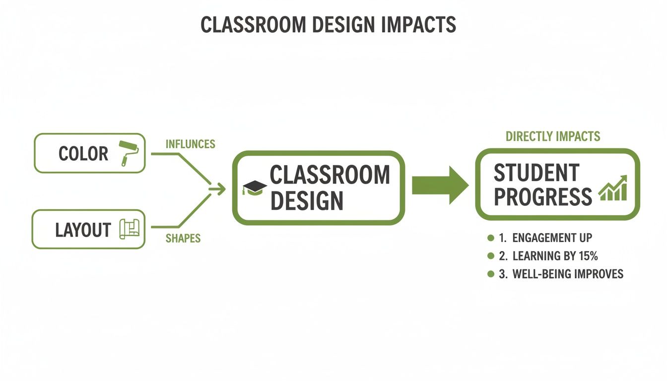
As the visual makes clear, strategic choices in the classroom environment aren't just minor details. They are foundational inputs that have a direct impact on learning outcomes.
The Power of Cool and Calming Hues
On the other side of the spectrum, cool colors like blues and greens act as a sort of "quiet focus filter." These colors are known for their calming effect, capable of lowering heart rates and easing feelings of anxiety. A soft blue can foster a serene, peaceful atmosphere, while green—often reminiscent of nature—is easy on the eyes and can boost concentration.
Because of these properties, cool tones are exceptionally well-suited for environments where deep thought and sustained focus are the goals. You’ll see them used effectively in:
- Libraries and Quiet Reading Nooks: Promoting a calm, focused environment for individual study.
- Testing and Examination Rooms: Helping to reduce stress so students can concentrate during assessments.
- Science and Math Classrooms: Supporting the detailed, analytical thinking needed for complex problem-solving.
Grasping how different shades influence behavior is key. Digging into the psychology of color choices, even down to small details, offers a more complete picture for designing an effective classroom from the ground up.
Finding the Right Balance With Saturation and Brightness
It's not just about picking "blue" or "yellow"—the specific shade matters immensely. Saturation (a color's intensity) and brightness (how light or dark it is) play a huge role in how a space actually feels. A highly saturated, vibrant lime green might be visually jarring and distracting, but a muted sage green can create a sense of calm and balance.
The goal isn’t just to add color, but to add the right color at the right intensity. An accent wall in a bright, stimulating hue can energize a room without overwhelming it, especially when the main walls provide a more neutral canvas for learning.
Let's break down how color properties influence the classroom atmosphere and where to best apply them.
Color Psychology in the Classroom
| Color Family | Psychological Effect | Ideal Application Area | Caution When Overused |
|---|---|---|---|
| Warm (Red, Orange, Yellow) | Stimulating, energizing, optimistic. Encourages creativity and social interaction. | Collaborative zones, art rooms, cafeterias, and active learning spaces. | Can feel agitating, increase anxiety, or become visually overwhelming. |
| Cool (Blue, Green, Purple) | Calming, focusing, serene. Reduces stress and promotes concentration. | Libraries, quiet reading areas, testing rooms, and spaces for individual study. | Can feel cold, impersonal, or sad if the space lacks warmth and light. |
| Neutral (Gray, Beige, White) | Balancing, grounding, clean. Provides a non-distracting background. | Main wall colors, hallways, and anywhere you need a versatile backdrop. | Can feel sterile, boring, or institutional without pops of accent color. |
By carefully modulating these attributes, you can fine-tune the psychological impact of every room. This foundational knowledge is the "why" behind every effective color palette, ensuring that the colors you choose for classrooms are not just beautiful, but are actively supporting the school's educational mission. A strategic approach like this turns a simple renovation into a meaningful investment in student success.
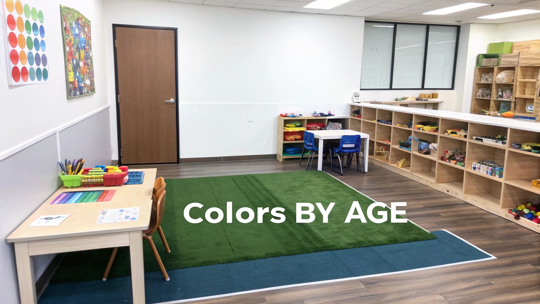
Choosing Age-Appropriate Color Palettes
A color scheme that’s perfect for a classroom of rambunctious preschoolers is going to feel completely out of place for high school seniors cramming for exams. It’s just common sense. As the curriculum changes with a student's age, the color palette of their environment needs to change right along with it. This isn't about just picking pretty colors; it's a strategic, age-specific approach rooted in how we grow and learn.
When you get this right, you can zone a single school building with different color schemes, creating distinct environments that actually help students of all ages. This isn't just a win for the kids—it makes the building more flexible and valuable for property owners and developers in the long run.
Colors for Early Learners: Preschool and Kindergarten
For the youngest students, the world is a giant playground of discovery, and their classroom should feel like it. This is where bright, primary, and secondary colors really shine. We’re talking bold yellows, vibrant blues, and cheerful greens. These high-contrast, stimulating colors are fantastic for grabbing a little one’s attention and sparking their natural curiosity.
These colors do more than just make a room feel fun; they support critical developmental milestones. Simple, clear colors are the building blocks that help young children learn to identify and name different shades.
But you can’t just splash them everywhere. A room drenched in powerful colors would be chaotic and overstimulating. The trick is to find the right balance:
- Start with a neutral base: Walls painted in a soft off-white or a light beige create a calm canvas.
- Be strategic with color: Use the bright, fun colors for accent walls, storage bins, rugs, and, of course, the toys themselves.
- Define activity zones: A splash of blue can signal a quiet reading corner, while a pop of sunny yellow might mark the art station.
This approach gives you a space that is vibrant and exciting but also organized—perfect for stimulating young minds without overwhelming them.
Palettes for Elementary School Students
Once kids hit elementary school, their learning style shifts. It becomes more structured, moving from free-form play to focused lessons. The classroom environment needs to keep pace. While bright colors still have a role, the overall palette should become more nuanced and balanced.
This is where secondary and tertiary colors come into their own. Think warm greens, softer oranges, and calming light blues. These hues provide enough visual interest to keep kids engaged but are less intense than primary colors, which helps cut down on distractions during instruction.
A well-designed elementary classroom uses color to support routine and focus. The goal is to create an environment that feels welcoming and energetic but also conducive to concentration and structured learning.
For instance, a soft green accent wall can subtly encourage focus, while a cheerful orange could be used in a breakout space to foster collaboration. The key is to dial back the high-energy saturation and move toward a more thoughtful application of color that gently guides attention instead of demanding it.
Sophisticated Hues for Middle and High School
By the time students get to middle and high school, their needs have completely changed. They’re tackling more complex subjects and need an environment that feels mature and helps them concentrate deeply. The bright, playful palettes from their younger years can now feel distracting, childish, or institutional.
For these older students, more sophisticated and desaturated tones work best. Think about palettes that incorporate:
- Subtle blues and grays: These create a calm, focused atmosphere that’s ideal for test-taking and individual study.
- Earthy greens and muted terracottas: These shades bring a sense of grounding and warmth, making a large space feel less sterile and more like a college campus.
- Deep, rich accent colors: A single navy blue or burgundy accent wall can add a touch of sophistication and visual depth without being distracting.
This kind of palette respects the students' maturity and provides a backdrop that supports higher-level thinking. Research backs this up, showing that while preschoolers love primary colors, teenagers consistently prefer more complex, desaturated tones.
For buildings with a long lifespan—like renovated schools or office-to-education conversions—this suggests a smart path forward: use durable, neutral bases with accent zones that are easy and inexpensive to update as the student population evolves. You can discover more insights about these age-based color findings to help shape long-term design strategies that stand the test of time.
Integrating Color with Light and Materials
Picking the right paint swatch is just the first step. To create a learning environment that truly works, your classroom colors have to play well with the room’s light and materials. Think of it like a three-part orchestra: the paint provides the melody, but the light and textures bring the rhythm and depth that make the entire composition come alive.
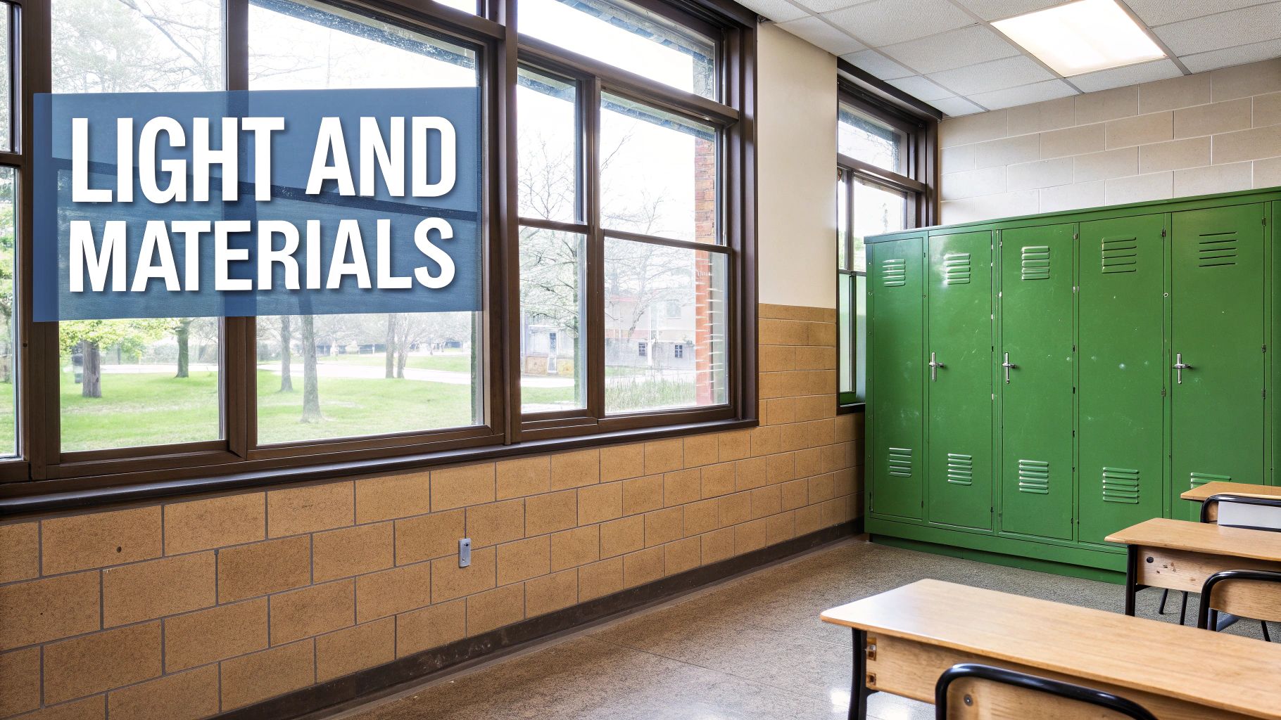
Simply painting walls without thinking about these other elements is like choosing an instrument without considering the acoustics of the concert hall. An architectural approach, on the other hand, ensures every element works together. It’s about creating a cohesive, high-performing space that goes way beyond a simple coat of paint.
The Critical Role of Natural Light
Natural daylight isn't static; it’s a dynamic element that dramatically changes how we see color. The exact same shade of blue can feel vibrant and airy in a room flooded with light from south-facing windows, but look muted and even somber in a north-facing room that gets less sun. This is precisely why a one-size-fits-all approach to classroom color so often falls flat.
The direction and quality of light have to guide your palette.
- South-Facing Rooms: These spaces get intense, warm light all day. To keep them from feeling too hot or overwhelmingly bright, it's smart to balance them with cooler tones like blues and greens.
- North-Facing Rooms: The light here is much cooler and more indirect. Warm colors—think soft yellows or cozy neutrals—are a great way to counteract the shadows and make the space feel more inviting.
- East- and West-Facing Rooms: These rooms see big shifts in light. East-facing rooms are bright in the morning, while west-facing rooms get that intense afternoon sun. A balanced, neutral palette often works best, letting you use artificial lighting to stabilize the mood as the day wears on.
A key metric to know is Light Reflectance Value (LRV). A color with a high LRV bounces more light around, making a space feel brighter and bigger. A low LRV absorbs light, creating a cozier or more dramatic feel. For classrooms, we often aim for an LRV between 60 and 70 on main walls to maximize daylight without creating harsh glare.
How Material Finishes Shape the Experience
Beyond light, the textures and finishes inside a classroom have a huge impact on the overall atmosphere. The same color will look and feel completely different depending on whether it’s on a smooth, glossy surface or a rough, matte one. This dance between color and material affects everything from the room's mood to its acoustics.
Just think about the difference a finish makes:
- Matte vs. Glossy: A matte finish soaks up light, giving colors a soft, muted look that’s great for hiding minor wall imperfections and cutting down on glare—perfect for the wall behind a smartboard. A glossy finish, on the other hand, reflects light, making colors pop with more intensity. It's durable and easy to clean, but high-gloss surfaces can create distracting reflections.
- Wood vs. Metal: Natural materials like wood bring in warmth and texture, grounding a space and making even a cool color palette feel more welcoming. Metal accents, however, can add a sleek, modern touch that fits well with a more contemporary design.
- Acoustic Panels vs. Hard Surfaces: Soft, porous materials like acoustic panels don't just absorb sound; they also absorb light, which can make colors appear deeper. Hard surfaces like concrete or tile reflect both sound and light, contributing to a more energetic—and potentially louder—environment.
Creating a Cohesive Architectural Palette
A truly thoughtful design integrates all of these elements right from the start. Instead of just picking paint colors in isolation, an architect looks at how the flooring, ceiling materials, window placement, and even the furniture finishes will interact with the palette. This holistic view is what makes all the pieces work in concert.
For instance, a classroom with exposed brick walls already has a powerful dose of warmth and texture. A great strategy would be to pair it with cool, calming colors on the other walls to create balance, rather than adding more warm tones that could become overwhelming. In the same way, a room with polished concrete floors might feel cold and institutional, but adding softer, warmer wall colors and wood furniture can completely change that feeling.
By considering the entire material and light profile of a room, you move from simple decorating to intentional environmental design—the kind that truly supports student well-being and academic success.
Practical Guidance on Durability and Maintenance
A thoughtfully designed classroom is a beautiful thing, but if it can't stand up to the daily chaos of school life, it’s not a practical design. For anyone managing a school property, the best colors for classrooms are the ones that balance aesthetic appeal with real-world performance. It's about making choices that are not just easy on the eyes, but also durable, safe, and cost-effective over the long haul.
Choosing the right paint finish is your first line of defense. High-traffic areas like hallways, entryways, and bustling classrooms are going to take a beating, and a standard flat paint just won't cut it.
The trick is to match the finish to the function of the space. A paint with a higher sheen is tougher and makes cleaning off scuffs, crayon marks, and fingerprints a whole lot easier.
Selecting the Right Paint Sheen
Different parts of a school have different needs. If you take a one-size-fits-all approach to paint finishes, you're just asking for premature wear and higher maintenance bills down the road.
- Satin or Eggshell: These finishes are the sweet spot, offering a great mix of durability and low glare. They’re perfect for classroom walls because they’re washable but won't create the distracting shine you'd get from a semi-gloss.
- Semi-Gloss: This is the workhorse for high-impact zones. Think trim, doors, and messy spaces like art rooms or cafeterias where you know frequent, heavy-duty cleaning is part of the routine.
- Matte or Flat: While they're fantastic for hiding imperfections on ceilings or behind projector screens, flat finishes are the least durable. It's best to keep them out of any area that gets a lot of traffic.
Beyond just standing up to wear and tear, the health of the indoor environment is critical. Thankfully, modern paints give us options that protect both the building and the people inside it.
Choosing low-VOC (Volatile Organic Compound) or zero-VOC paints isn't just a trend; it's a best practice. These paints drastically cut down on off-gassing, which means better indoor air quality for students and staff.
Designing for Long-Term Value
A smart color strategy can also put a serious dent in your long-term maintenance budget. Instead of painting an entire hallway in a trendy, bold color that will need a complete repaint in a few years, a more strategic approach will deliver much better value.
The key is to use durable, timeless neutrals as your base color throughout the building. Foundational colors like soft grays or warm off-whites won’t go out of style and are incredibly easy to touch up when needed.
Then, you can bring in the vibrant, stimulating colors in smaller, more manageable ways.
- Accent Walls: It is far cheaper and faster to repaint a single wall in a classroom than it is to do the whole room. This strategy allows for simple updates as teaching needs evolve or just as a cost-effective refresh.
- Changeable Elements: You can also inject color through less permanent fixtures. Think furniture, colorful storage bins, or acoustic panels. These items can be swapped out to give a room a whole new look without the labor and cost of repainting.
This method—a durable, neutral foundation with easily updated pops of color—creates a flexible and future-proof design. It proves that the right colors for classrooms aren't just an expense, but a smart investment that benefits students while protecting the bottom line.
Your Top Questions About Classroom Color Design, Answered
Even after you're sold on the psychology, putting a new color strategy into practice can feel like a whole different challenge. School administrators and developers I talk to are always wrestling with the same practical questions: How do we handle the cost? How do we get the board to approve it? And does this really make a difference?
These are the real-world hurdles. Let’s walk through the answers to the questions we hear most often, so you can move from theory to a successful repaint.
How Much Does a Strategic Repaint Actually Cost?
The price tag for repainting a school can vary wildly, but it's almost always more manageable than people think. Of course, the final cost depends on the size of the building, the shape the walls are in, the quality of paint you choose, and local labor rates. But here's the thing: a strategic approach doesn't have to mean an expensive one.
You can create a huge impact without a massive budget by being smart about where you put the color. Painting a single accent wall in a dozen classrooms is far more cost-effective than a full repaint of every room. You can also take a phased approach, tackling one wing or grade level at a time to make the investment easier to handle.
The key is to stop thinking of this as a maintenance expense and start seeing it as a capital improvement. When a smart color plan can boost student outcomes, the return on investment goes far beyond just looking good.
How Do I Justify This Investment to Stakeholders?
Getting a school board, a PTO, or a group of investors on board requires a case built on solid data, not just personal taste. You have to frame the conversation around performance and long-term value.
Here are three talking points that work:
- Lead with Academic Outcomes: Start with the evidence. Point to studies showing that well-designed classrooms can improve student progress by as much as 16-25%. An investment that directly ties to academic achievement is a much easier sell than one that just "looks nice."
- Talk About Better Behavior: Explain how the right color palette can create a calmer, less overstimulating environment. This isn't just fluff—it translates directly to fewer classroom disruptions, which is a tangible win for teachers, students, and administrators alike.
- Emphasize Long-Term Value: A well-planned color scheme, built around durable neutrals and easy-to-update accent walls, is a financially sound decision. It actually lowers future maintenance costs and creates a flexible space that can adapt as needs change, which enhances the building's value as an asset.
Will a New Coat of Paint Really Make a Difference?
Absolutely. While paint alone won't fix every problem in education, it's a surprisingly powerful tool that often gets overlooked. Think about it: the classroom environment is a constant, subtle influence on every student, all day long. A chaotic, visually jarring space creates a low-grade, persistent hum of stress and distraction.
On the flip side, a room designed with intentional colors provides a supportive backdrop for learning. It might help an anxious student feel a little calmer before a big test, or encourage a shy kid to join a group activity. It can even help a distracted student stay focused on a tough lesson. These small, daily impacts add up over an entire school year, creating significant, measurable improvements in both performance and well-being.
What’s the Best Way to Get Started?
Taking on a school-wide redesign can feel overwhelming, but a simple, structured approach makes all the difference. The first step isn’t picking paint chips—it’s defining your goals.
- Step 1: Assess Your Current Environment. Walk the halls and really look at your spaces. Are the hallways dark and gloomy? Do some classrooms feel chaotic while others feel sterile and cold? Make notes on how different areas are used throughout the day.
- Step 2: Define Goals for Each Space. Decide on the mood and function for each zone. The library obviously needs a palette that encourages quiet focus, while the cafeteria could use colors that spark energy and social connection.
- Step 3: Talk to an Expert. Bringing in an architect or designer with experience in educational spaces is a game-changer. They can translate your goals into a cohesive, evidence-based plan that also accounts for critical factors like lighting, materials, and building codes.
- Step 4: Create a Phased Plan. Remember, you don't have to do it all at once. Work with your team to develop a multi-year plan that tackles the highest-priority areas first. This keeps the budget manageable and minimizes disruption to the school day.
By asking the right questions from the start, you can build a color strategy that doesn't just refresh your facility but actively supports its educational mission.
A thoughtful color strategy is a cornerstone of effective educational design. At Sherer Architects, LLC, we combine rigorous research with decades of architectural experience to create learning environments that are beautiful, durable, and optimized for student success. If you're ready to transform your educational facility into a high-performing asset, contact us to see how we can bring structure to your vision. Learn more at Sherer Architects, LLC.